MOMI
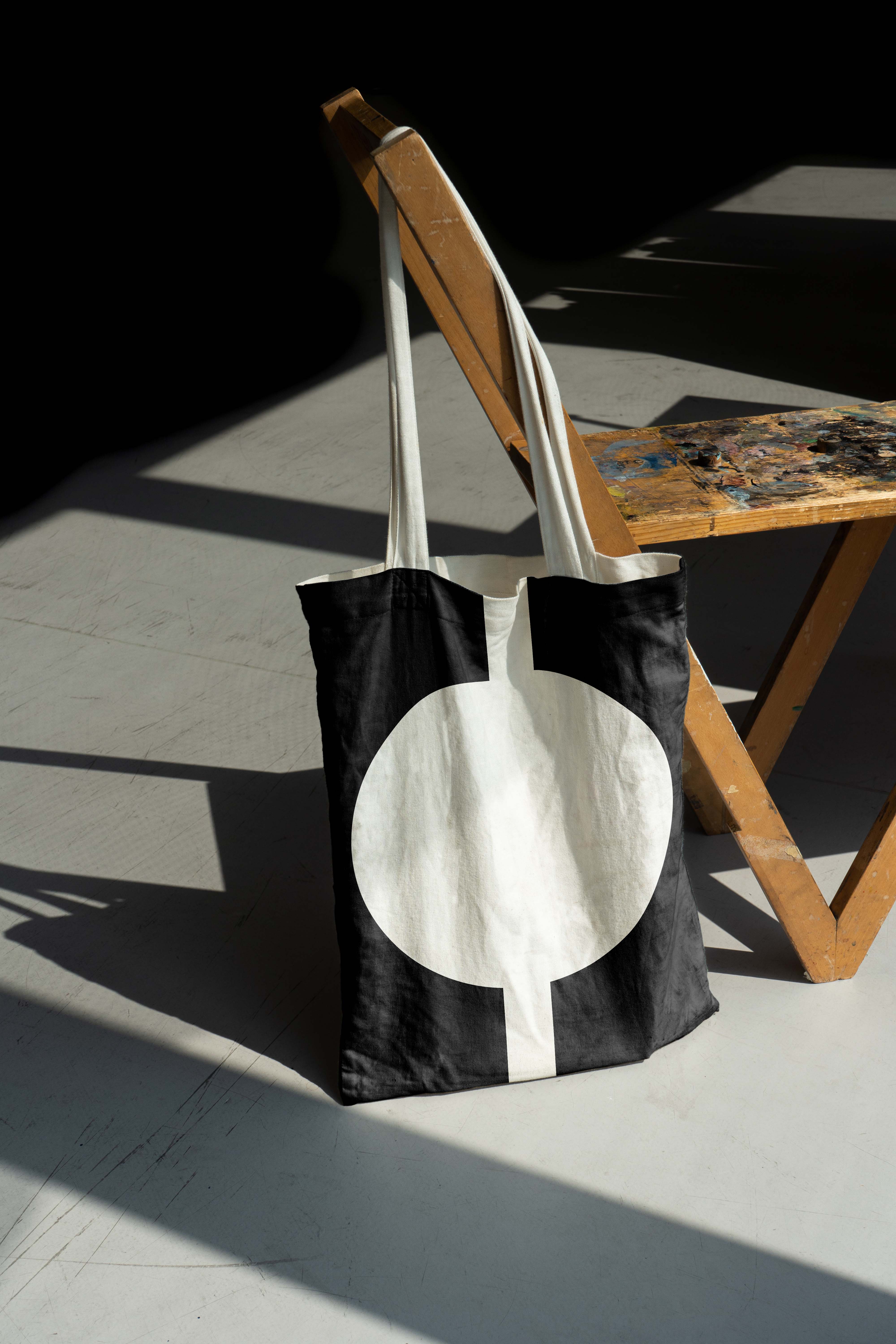
The Museum of the Moving Image is dedicated to the art, history, and technology of film. The new visual identity aims to celebrate the beauty of this modern classical medium. While relatively new compared to the history of printing, film becomes timeless once captured by the camera and transformed into movies. We hope the audience will get fasinated to film and moving image culture at MOMI.

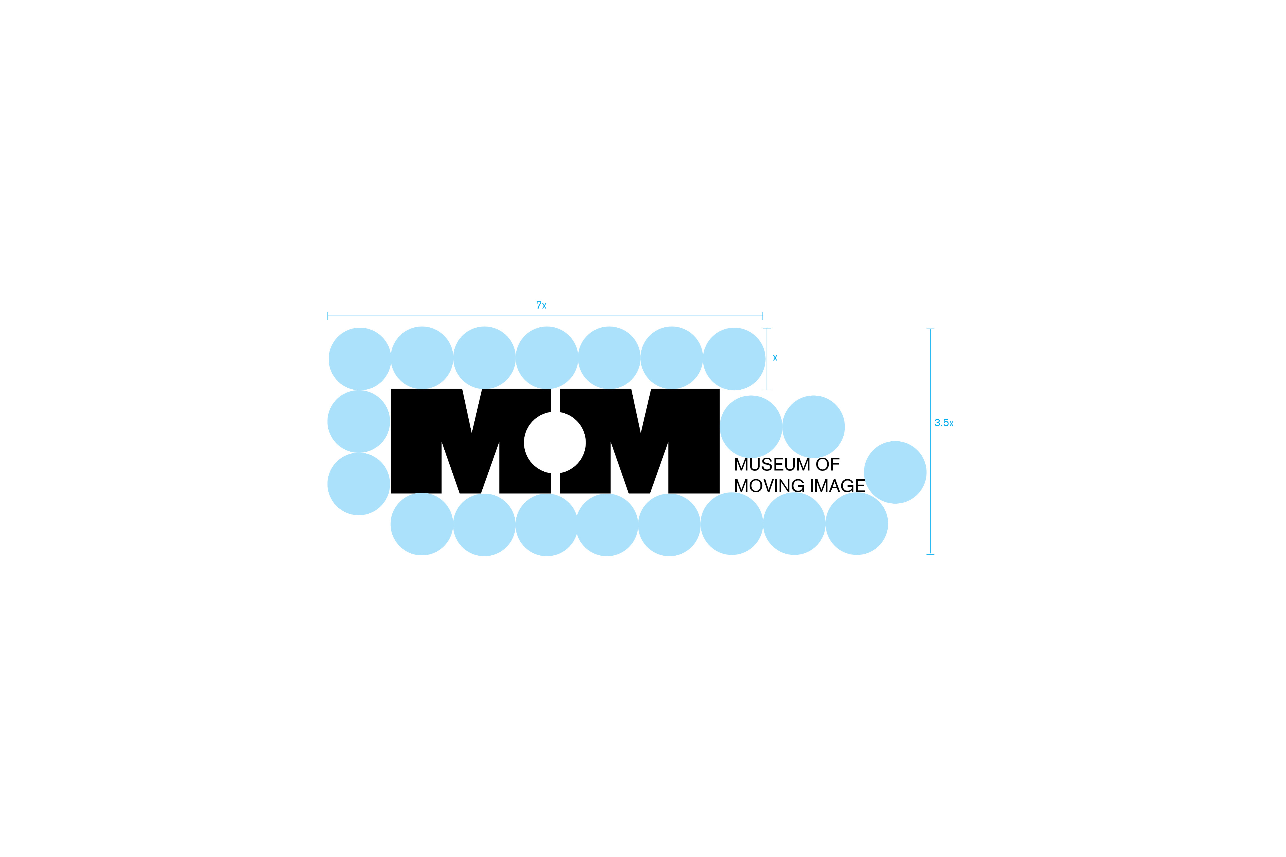
︎︎︎Logo Motion

︎︎︎Using circles as secondary graphic language to create posters and banners.


︎︎︎The web is designed in a minimalistic manner with consistent graphic elements.
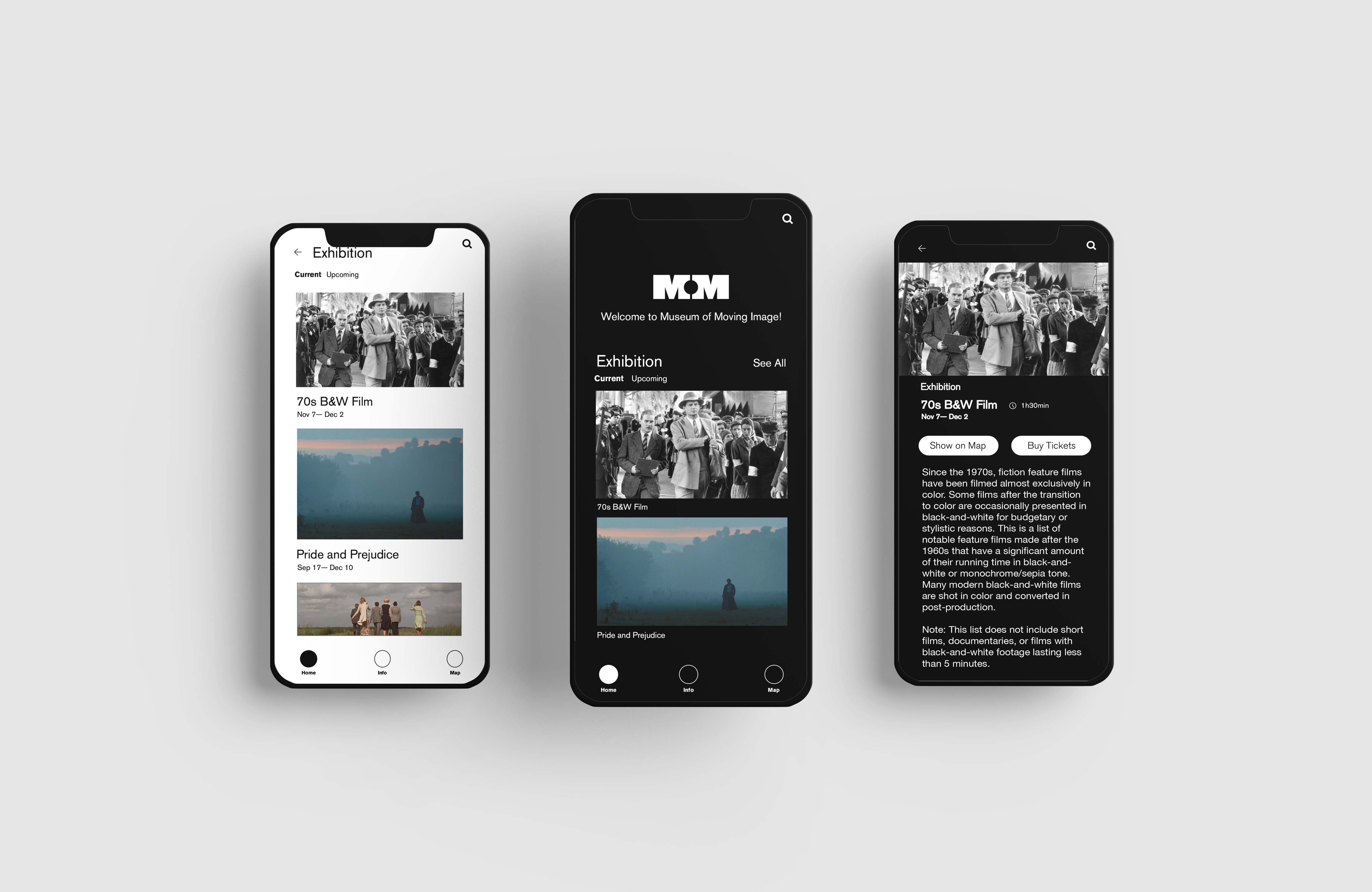
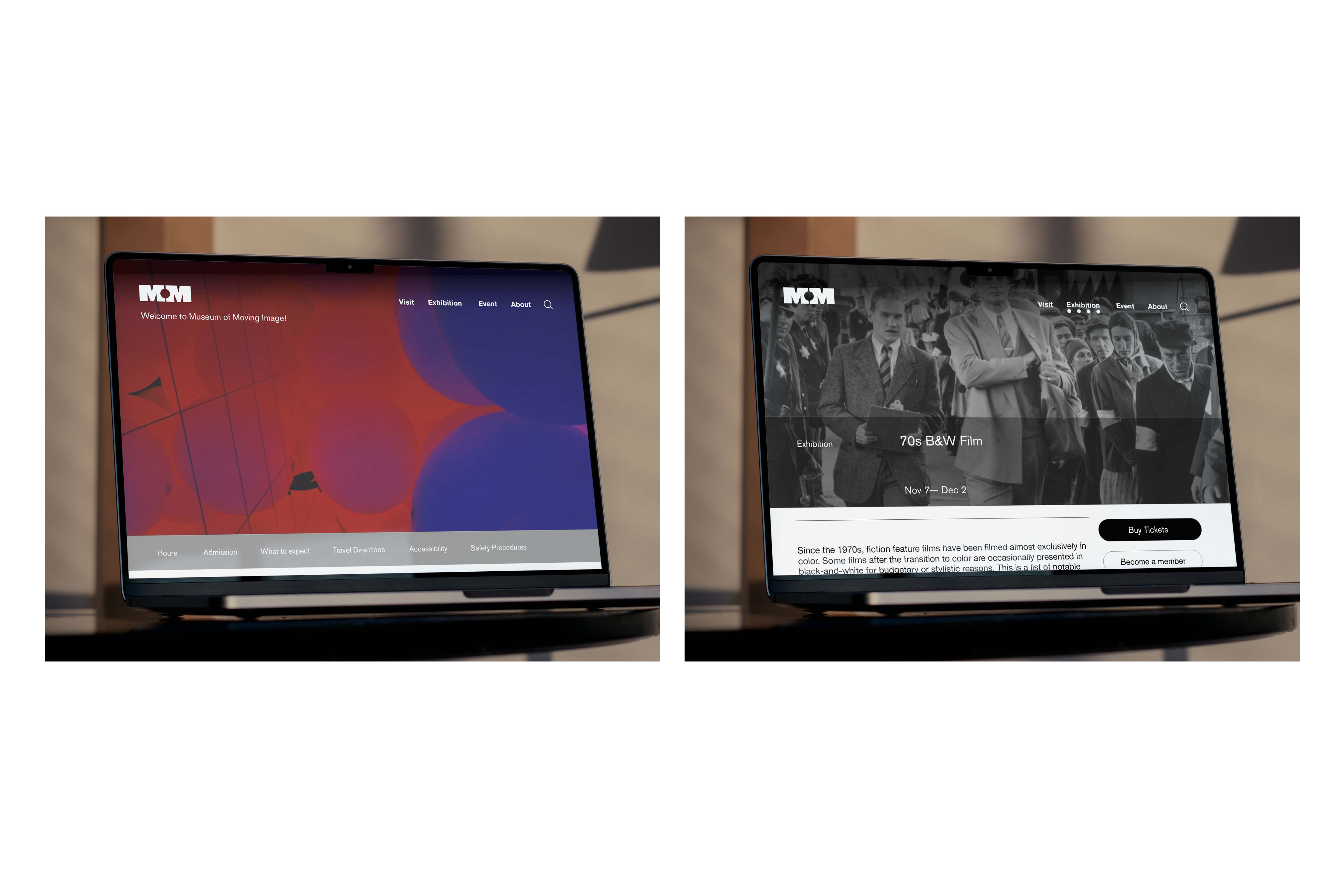
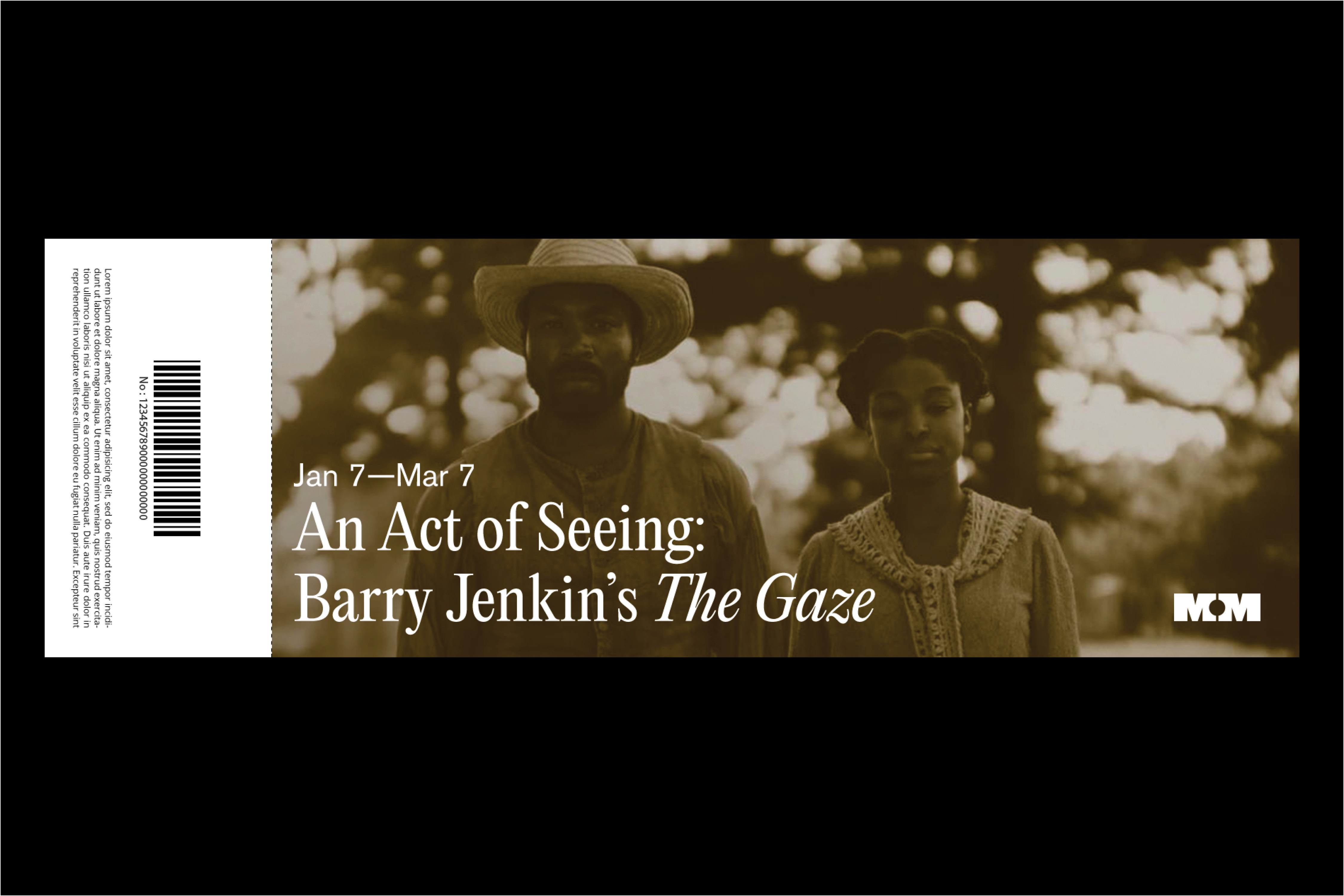
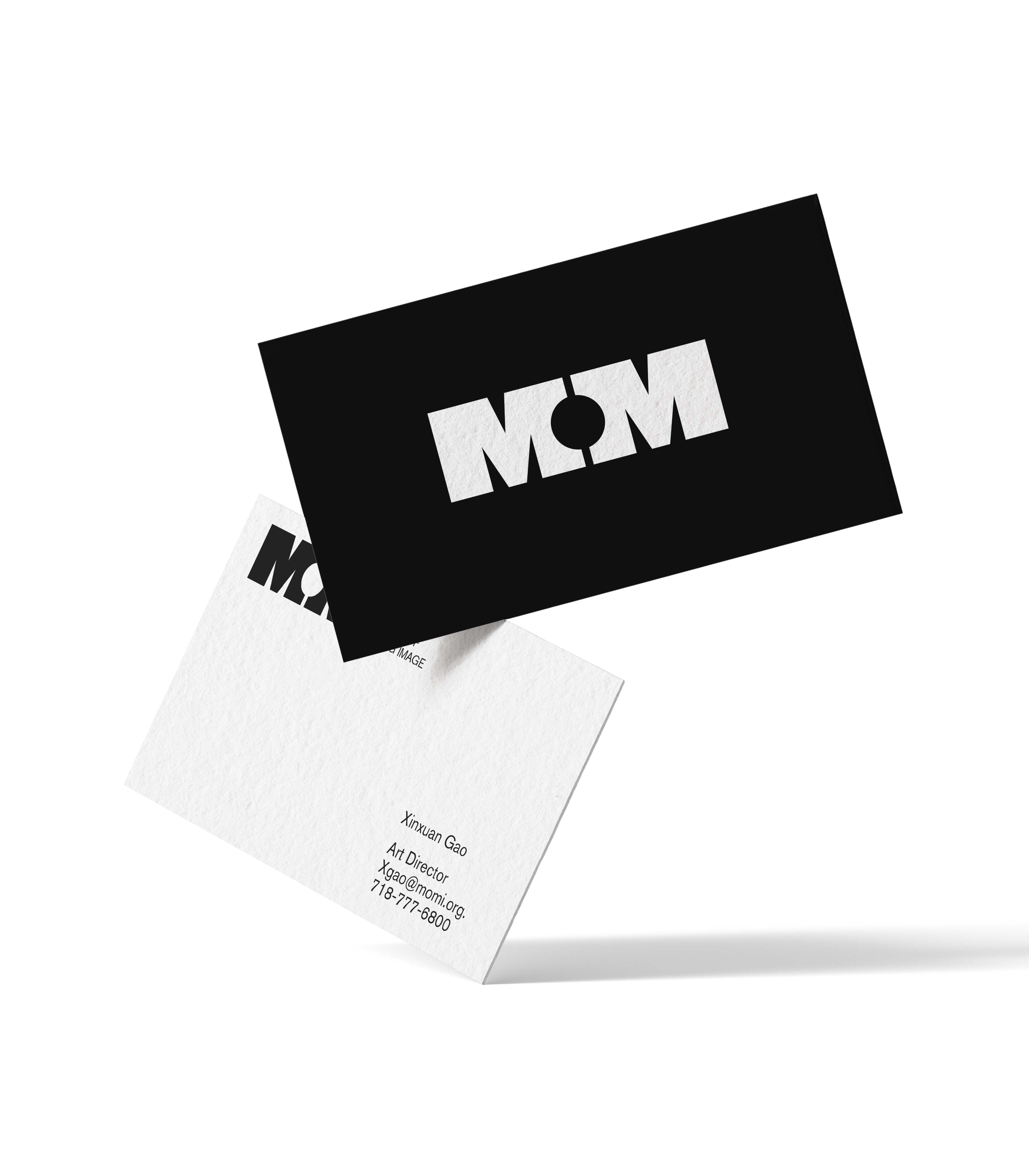
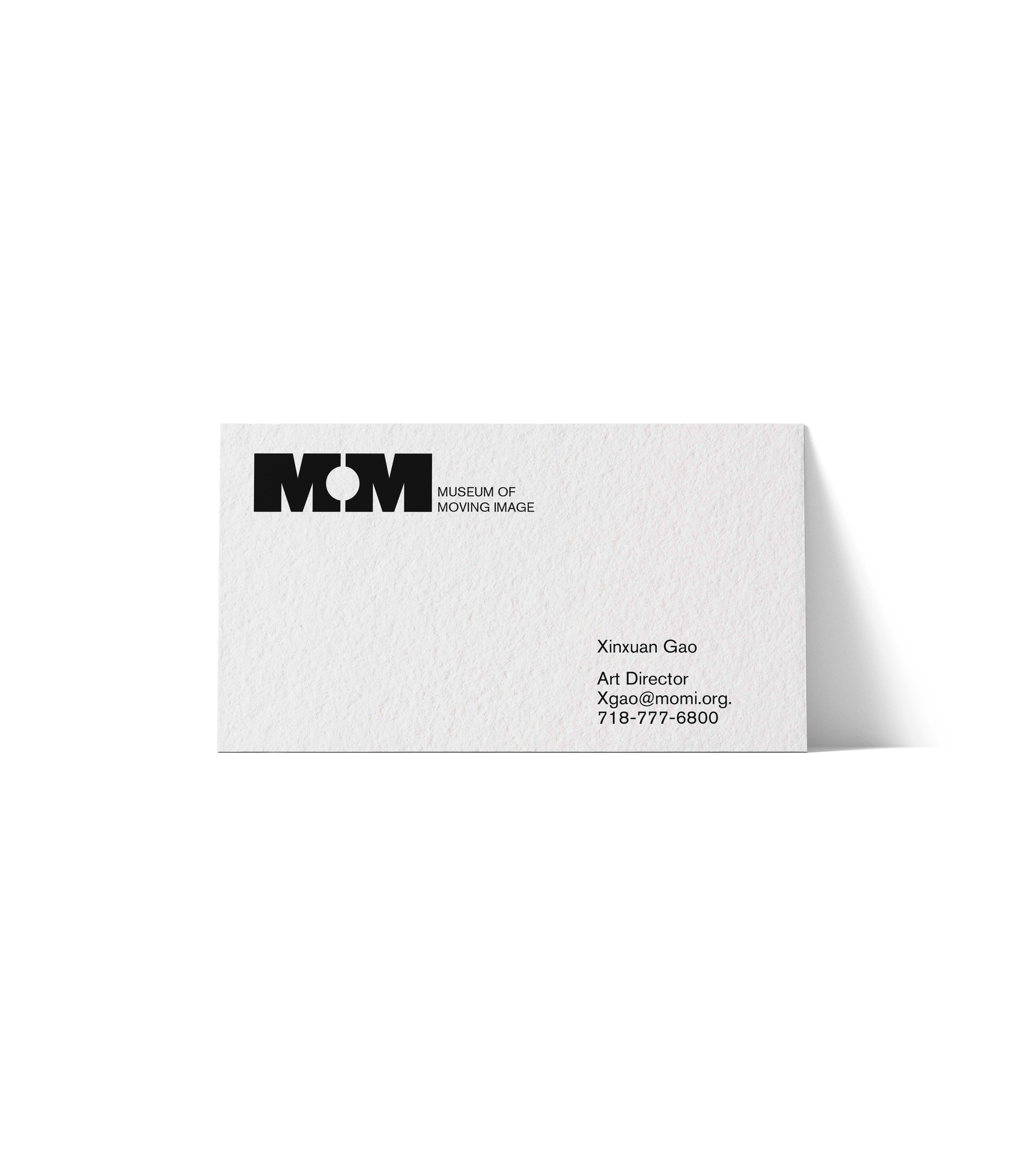
︎︎︎Collaterals


︎︎︎Environmental & Interior Design
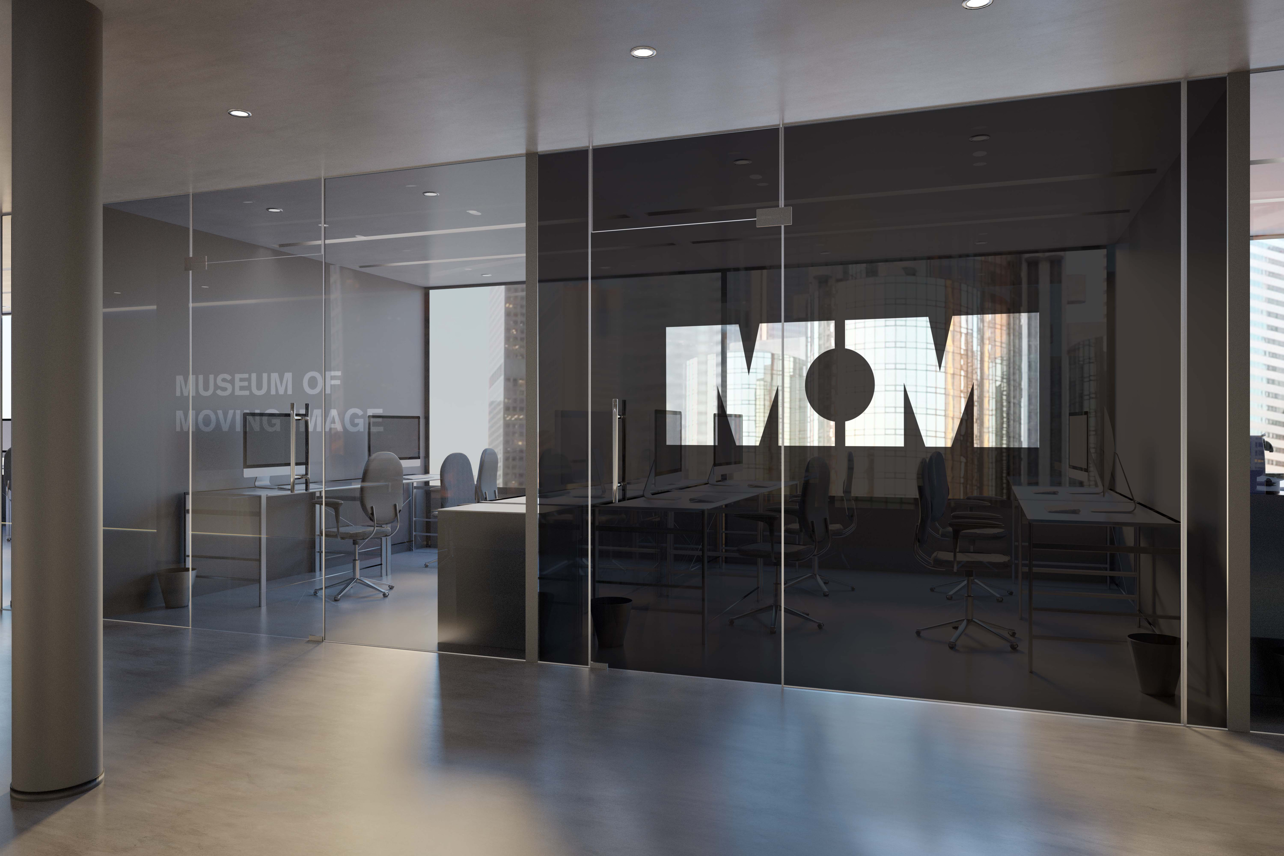

︎︎︎Through spatial experimentation with graphic language and movie clips, the hypothetical concept will integrate with the museum's interior. The distorted typography and furniture will creae intriguing visual effects.
36 Experiments
2020
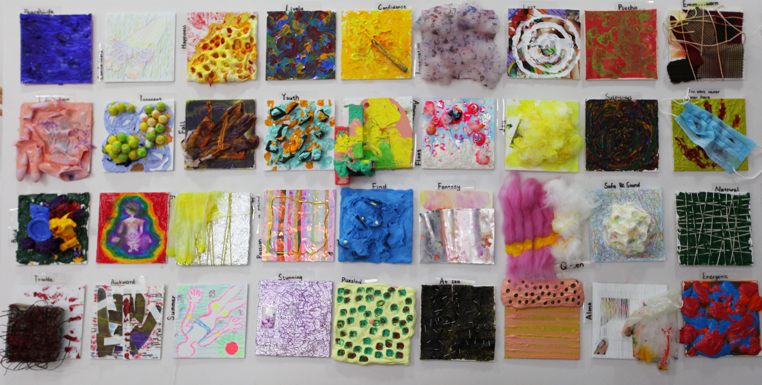
In the installation, 36 experiments, I used a variety colors of aryclic pigments to create random painting on 36 15x15cm canvases. Try to allow myself to try different possibilities and discover the occasional stunning effects. The whole process was free and spontaneous, which is a very exciting experience.


Assimilation
2020
Painting(mix material, 15x15cm and 10x15cm)
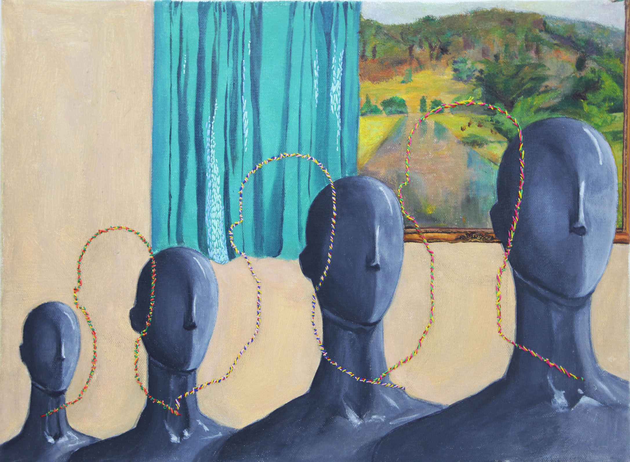
When we proceed too fast or bindly follow others’ pace, we are gradually assimilated, and forget who we are.
This is a series of Assimilation, including two pieces.
When we proceed too fast or bindly follow others’ pace, we are gradually assimilated, and forget who we are.
This is a series of Assimilation, including two pieces.

Nest
2021
Nest is my first 3D motion piece using Cinema 4D, it is a fun experience. In this work I focused on exploring the strength from diverse components and different camera views.
In this project, the feathers, leaves and twigs are building the nest, which is revealed in the last scene.
In this project, the feathers, leaves and twigs are building the nest, which is revealed in the last scene.
Alta Sans
2021
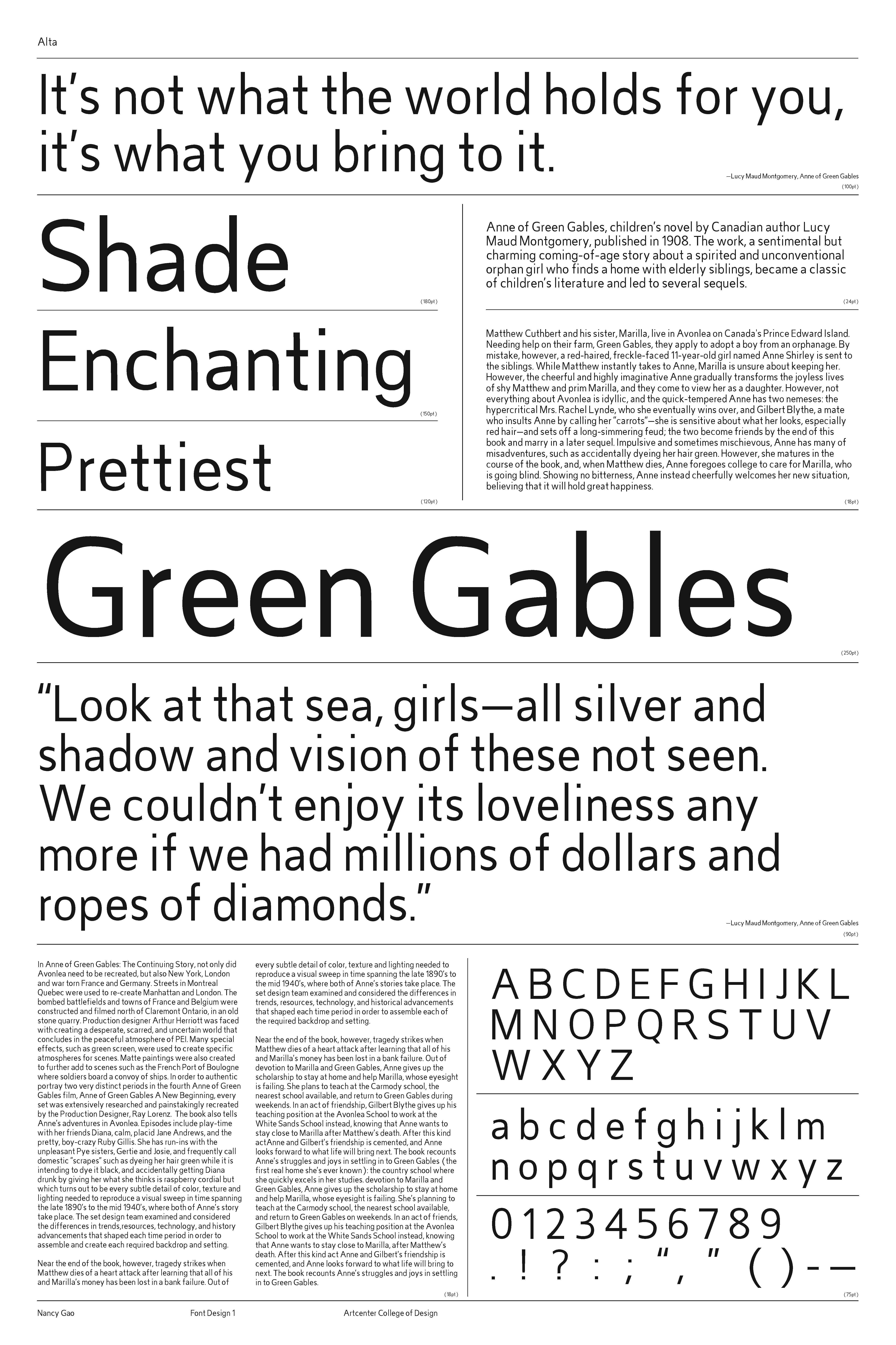
It’s my first time designing my own font. This san serif called Alta sans tried to have a well-balanced and neutral sense when I draw and design it so that it’s easy for people to read.
Usage: magazine, any prints.
Usage: magazine, any prints.